Weifang City: Destination Branding

Client: Weifang City
Challenge: White Space Exploration, Brand Positioning, Brand Activation
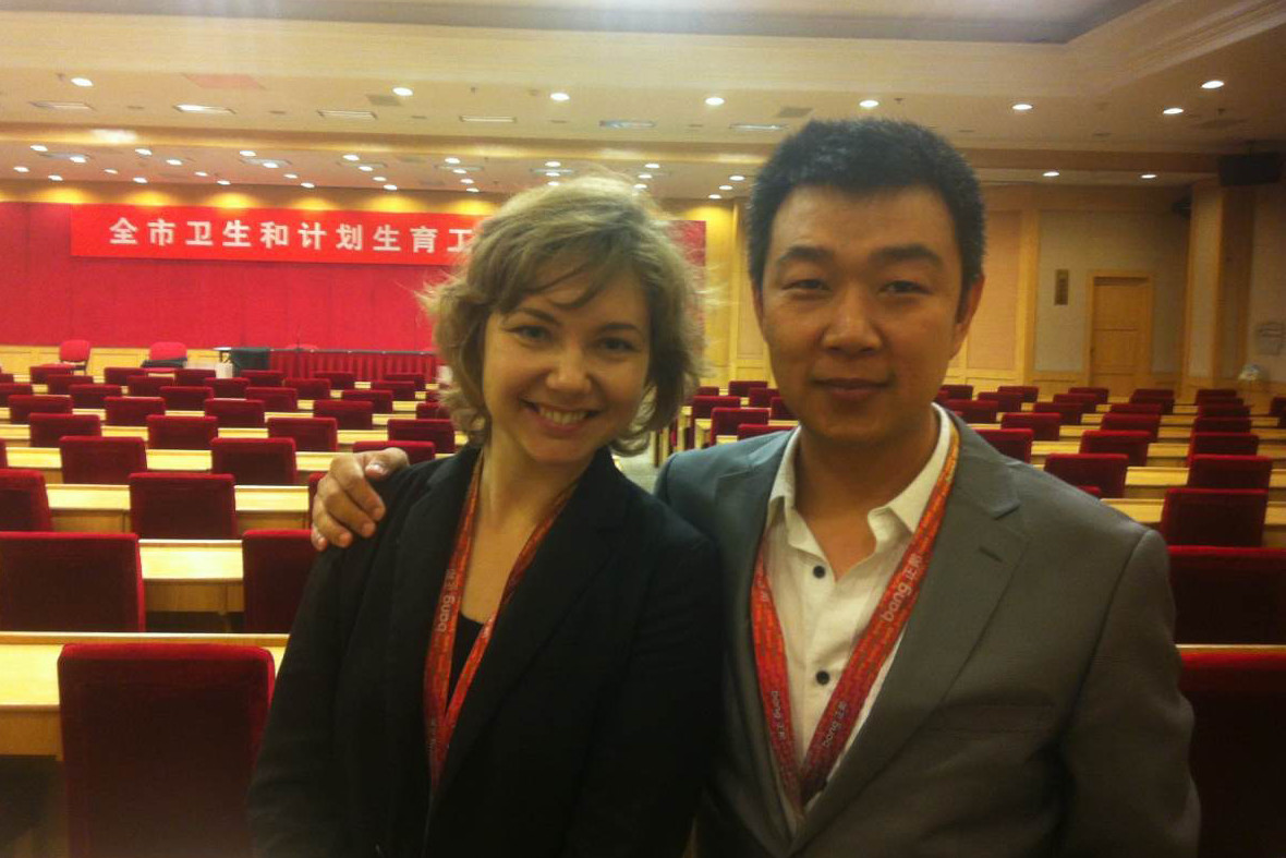
My role: Strategy Director
Agency: ZhengBang
May 2015, Beijing China
Weifang is a cradle of Chinese culture, the second wealthiest city in Shandong province, and home to more than 9 million lives—yet just one more Chinese city, among many.
WE WERE HIRED BY THE COMMUNISTS PARTY OF CHINA TO ATTRACT FOREIGN INVESTMENT TO AN AVERAGE CHINA CITY
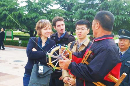
When we started the project the city was famous among local kite lovers for the annual Kite Festival - a valuable brand asset, but one too regional to draw investors.
We went to the city for an audit, to discover which of Weifang’s assets can be leveraged to Weifang’s brand equities, and how those equities can fill white spaces in the context of international investments.
EXPLORING WHAT THE CITY HAS TO OFFER TO THE WORLD
After a series of interviews with officials and business leaders, and conversations with residents of the city, we learned that Weifang is perceived as a great city to live in. The local business community showed that Weifang was attractive to investors not only money-wise, but also lifestyle-wise. People love the city’s fresh air (“it is the city of breezes”) and food (“I ate like a here”); we embraced these ideas and positioned the city in contrast to Beijing and Shanghai, China’s internationally famous political and financial centers.
Here is where “the city of kites” came into the game: we used the idea to emphasize how windy the city is, suggesting the importance of the ecological and natural, unlike the heavily polluted megacities.
We decided to amplify those motivations and offered the following brand promise: unlike heavily polluted Beijing and Shanghai, Weifang is a city, where one can experience Chinese life, not just factories and banks.
RECRUITING BRAND AMBASSADORS
Regardless of the potential investors this might draw, we always prioritized meeting the ambitions and values of Weifang-ren (inhabitants of the city). Not only are they who will live with our work, but also they are who will advocate for their home city to anyone we might try to reach.
To empower Weifang-ren to share their city’s promise, we translated Weifang values into visual symbols, using the most balanced letter in the alphabet, “W.” This embraced the city values and assets, which are enhanced by the brand positioning: well-being, welcoming, and warmth, among others. To translate this idea to Chinese we used the pool of Chinese characters, from which we chose the character Wei (濰, same as the city)
We launched “W” and “濰” as the main brand activation framework.
RESULT
Weifang rolled out its brand activation across all media platforms, targeting the domestic market first. The number of visitors has increased by 15% year-on-year, which is significantly above China’s average, and web traffic regarding Weifang has similarly increased with increasing media presence.
The project also led to infrastructure projects in collaboration with GIZ, a German development agency. It was a great honor to work on this project.