CRRC: To establish cultural relevancy of a symbol, globally

Client: China Railroads Corporation
Challenge: Cross Cultural Testing
My role: Team Manager, Brand Researcher
Agency: Zheng Bang
May 2015, Beijing
Cultural translation of symbols
A single symbol may have as many meanings as there are cultures, and likely even more than that. To verify cultural translations of any given symbol, we developed a framework - the Utopia evaluation framework.
Even if the magic of design cannot be directly quantified, cross cultural checks about a symbol’s meanings are a must in our global culture. Symbols have meanings developed in particular contexts. If a symbol is powerful and represents particular meanings, it depends on its environment to do so. Once it crosses a border, it could turn out to represent an opposite meaning, which may significantly diminish the power of the brand or even harm the business (just ask about Uber’s re-branding in China).
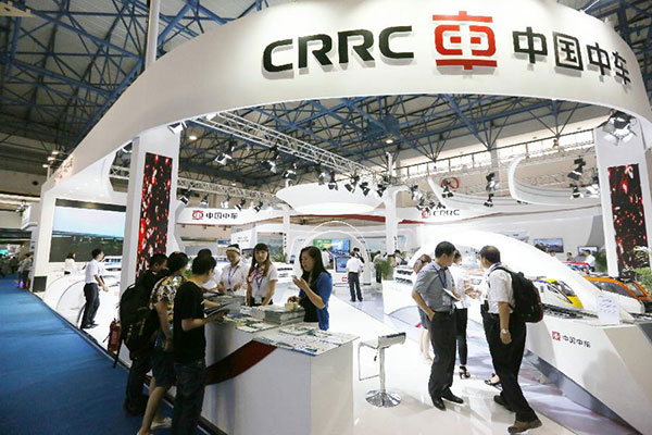
CRRC: Can a chinese symbol be exported without losing its power?
In May 2015 we worked with the newly merged Chinese railway monopoly -- China Railway Rolling Stock Corp (CRRC), the biggest railway corporation on the planet. To satisfy the client's ambition, the design solution required a strong visual mark which represents “world-leading” and “multinational integrated solution provider of superior rail equipment.” But could this be exported from China to the global community?
Questions about design: it is not about opinions, it is about understanding.
For this, we used my proprietary Utopia evaluation system: sampling international respondents from key territories of the brand operation, taking into consideration their native languages and cultures, and incorporating important themes and patterns from their feedback into the design solution.
We tested three aspects of the logo:
- Functionality
- Meaning / Appropriateness
- Uniqueness
As the results showed, the symbol does not have any particular meanings across all tested cultures - it meant this symbol was open to being populated with meanings as the business is developing. There was a significant difference between Chinese and non-Chinese speakers: Chinese speakers immediately recognized the character che (車), which means “transportation,” while non-Chinese speakers didn’t. There, to retain the power of the logo even for non-Chinese speakers, we recommended the addition of Chinese visual cues in the typeface. We suggested to explore further typeface options and to tie closely the symbol and the script, and to pay homage with the hidden character to all Chinese speakers, domestically and abroad.
Testing results
Overall, the CRRC logo “met expectations” across functionality and meaning. In order to enhance the logo attribute of uniqueness, we recommended typeface modifications. As a result of our recommendations, the logo typeface was modified and released to the world.
If you would like to read more, click here
If you would like to talk more about the Utopia evaluation framework -> drop me a line on my email